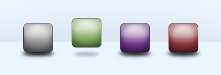
For one of the projects I’m currently working on with Rareview, we wanted to add a rising hover effect to a set of icon links. Using jQuery’s animate effect, I experimented with icons that have reflections and others with shadows. Here is a demo with two examples:
The HTML and CSS are both straightforward and have a structure and style common to many web navigations and menus (for the sake of post length, I’m not including HTML/CSS code examples here but you are free to snoop around in the demo or view the files in the download below).
In a nutshell, the JS appends the reflection/shadow to each <li>, then animates the position and opacity of these elements and the icon links on hover. I’ve added .stop() to eliminate any queue buildup from quickly mousing back and forth over the navigation.
// Begin jQuery $(document).ready(function() { /* =Reflection Nav -------------------------------------------------------------------------- */ // Append span to each LI to add reflection $("#nav-reflection li").append(""); // Animate buttons, move reflection and fade $("#nav-reflection a").hover(function() { $(this).stop().animate({ marginTop: "-10px" }, 200); $(this).parent().find("span").stop().animate({ marginTop: "18px", opacity: 0.25 }, 200); },function(){ $(this).stop().animate({ marginTop: "0px" }, 300); $(this).parent().find("span").stop().animate({ marginTop: "1px", opacity: 1 }, 300); }); /* =Shadow Nav -------------------------------------------------------------------------- */ // Append shadow image to each LI $("#nav-shadow li").append('<img class="shadow" src="images/icons-shadow.jpg" alt="" width="81" height="27" />'); // Animate buttons, shrink and fade shadow $("#nav-shadow li").hover(function() { var e = this; $(e).find("a").stop().animate({ marginTop: "-14px" }, 250, function() { $(e).find("a").animate({ marginTop: "-10px" }, 250); }); $(e).find("img.shadow").stop().animate({ width: "80%", height: "20px", marginLeft: "8px", opacity: 0.25 }, 250); },function(){ var e = this; $(e).find("a").stop().animate({ marginTop: "4px" }, 250, function() { $(e).find("a").animate({ marginTop: "0px" }, 250); }); $(e).find("img.shadow").stop().animate({ width: "100%", height: "27px", marginLeft: "0px", opacity: 1 }, 250); }); // End jQuery });
Please note, for the purposes of this quick demo, I did not bother including support for IE6.
Update 06/01/2009: I updated the shadow example so that it has more of a bounce to it.
Update 07/08/2009: As Cody Lindley points out in the comments (thanks!), this example does not require the UI and could work with jQuery alone (I’ve updated the link in the post). However, this being a navigation example, I’ll leave the UI script in the demo and download for users who want to experiment with animating text, background, borders, or outline colors.


Nice job… the shadow effect especially looks superb.
Brought a smile to my face.
Not sure which one I prefer, the shadow or the reflection – both look great.
very good stuff Adrian…will certainly be taking advantage of this tutorial. thanks for sharing.
That’s really cool Adrian. I just started using jQuery for a project rebuilding my Sensai’s website (www.wm-ma.com). I’ve gotta say, it saves a lot of time vs. regular Javascript development!
Nice work! One small clarification. animate() is part of jQuery core. jQuery UI is not needed.
REALLY like the look of this! Well done!
@Cody: You’re absolutely right, thank you for catching that! The demo above does not require the UI and could work with jQuery alone. I suppose if you wanted to add text to the navigation, or a border/background color, then the UI would be useful in animating color changes.
I feel I should point out that although the effect looks cool, the fact that the shadows get smaller is not scientifically correct.
@Paul: Haha, right you are. Good thing this is only a demo
very godd effect, probably i will use it someday
thx
Muito Bom!
really nice effect jquery rock and i bookmarked this link.
Absolutely superb – looks really stunning. Good job!
I prefer the shadow design. Very cool, thanks for sharing
Fantastic!! it’s really real!!
Thanks for share it!!
Very cool man! jQuery rocks…just starting to get into it. Like the design of your site too, nice typography!
~ David
Cool effects! Thanx for sharing
pretty nifty–Q: how do you get your text visible on the button?
@russ: If you check out the HTML, the link text is inside the anchor tag. For this example, I added a large text-indent and hidden overflow so the text wouldn’t be visible with the icons. You could, of course, change this and set it up however you want.
text-indent and hidden overflow so the text wouldn’t be visible with the icons.
whoa, shadow rules!
Wow this is great, I can see myself using this effect. Very nice and smooth, even in Firefox 2 with all my add-ons.
Trying to get it to work with my horizontal navigation, but not having any luck. Any suggestions (im implementing in my given website).
This really looks great. Nice and usefull tutorial
Very nice work. Thank you.
Love it thanks – makes all the difference when you can add shaddow.
Hey, good work!
You NEED to port this over to Moo!
Josh
http://www9.speedyshare.com/data/283223742/17971670/21853130/Unbenannt3.JPG
if you move your mouse fast between two of them, this might happen!:O
and usualy all the way to the right
Great effect. I’ll have to use it on my web design portfolio soon. Please keep em coming!
This is not an original idea: we have developed this effect for our website http://www.informinds.com (published on 14 october 2008) . This is visible in the section “Prodotti”
Nice!
It doesn’t work on Google Chrome though, dunno why…
Oh! Very nice job, its great!
Thanks for share!
Marcio.
Absolutely Brilliant!! I love the Bouncy shadow version, and the sound effect is a nice touch too!
Very nice script, but …. I don’t see the “Link text” in the demo page !
(Linux, Firefox 3.5.3).
Hey, where is the link text (Link Text) in the demo ?
I don’t see it ! And the moving pictures don’t give me any information!
Wow, this could be useful for me ^_^. Thanks so much adrian !!!
That is awesome. Well done.
That looks awesome! I’m glad I found this.
@Informinds Consulting: Nope, the hover effect is not a groundbreaker but one big difference between your example and mine is your site uses flash, whereas my demo is a combination of HTML, CSS, and Javascript.
@David: There should be no issues with Chrome.
@everyone looking for text: I have the text hidden using a large indent and hidden overflow in the CSS. This is a demo only; feel free to make your own edits to include text if you want.
Look nice
I love this,but, i think its better to do this without make a single reflect for each image!!!
so i combine this solution with reflect plugin ( see this : http://docs.jquery.com/Plugins:reflect )
you can see my demo here :
http://daneshpour.org/jquery/ref_ani/
I hope this will be usefull !
Hey bro – nice job! I implemented it, and it works perfect. However, I have one question, do you happen to know why when you use a .png for the “shadow” IE (all versions) blows up the shadow to ten times it’s original size. On first load, before hover, it’s fine.
I tested this in yours, without changing a single thing, just to be sure, and IE does the same in your demo. Any ideas why? Thanks for your time!
OK, the problem is caused by the opacity code below. If I remove it, the IE7/8 problem goes away. But, then I loose part of the effect. Any way to write that so IE is happy with the opacity??? Thanks!
$(document).ready(function() {
// Append shadow image to each LI
$(“#nav li”).append(”);
// Animate buttons, shrink and fade shadow
$(“#nav li”).hover(function() {
var e = this;
$(e).find(“a”).stop().animate({ marginTop: “-14px” }, 250, function() {
$(e).find(“a”).animate({ marginTop: “-10px” }, 250);
});
$(e).find(“img.shadow”).stop().animate({ width: “85px”, height: “20px”, marginLeft: “10px”, opacity: 0.25 }, 250);
},function(){
var e = this;
$(e).find(“a”).stop().animate({ marginTop: “4px” }, 250, function() {
$(e).find(“a”).animate({ marginTop: “0px” }, 250);
});
$(e).find(“img.shadow”).stop().animate({ width: “105px”, height: “27px”, marginLeft: “0″, opacity: 1 }, 250);
});
});
Hi,
This tutorial is simply awesome.
I have a problem though. In this demo, images do not change form or color when they are hovered over. But I need that effect, such that when the user hovers over the image, the image color changes(thats just a matter of changing the image on hover ). I have been successful in doing it so far, but there is this one problem. When i hover, the color changes, but when I move the mouse back, (I am still in the hover function), the image takes its original color… sort of like a flickering effect. Could you please tell me how to retain the hover effect even when a user moves the mouse away ?
@Adrian: Nope, in our website there is no Flash, only HTML, CSS, and Javascript too. So, it’s not an original idea.
Quote:
@Informinds Consulting: Nope, the hover effect is not a groundbreaker but one big difference between your example and mine is your site uses flash, whereas my demo is a combination of HTML, CSS, and Javascript.
@Informinds: My mistake, you have a very flash-like website
At any rate, the point of this tutorial was simply to show a code example of how to achieve an effect I liked. You’re more than welcome to write your own tutorials for your “original” idea.
nice..it smoot animated. thank for code download
Thanks, really cool!!!
Hi Adrian,
First, thanks for the great effect! I’m using it in this new site: http:bendmagic.com.
My problem is with IE7 & 8…the shadows become opaque on hover. As I understand (and I’m no js guru) IE has trouble with opacity changes in png files. Is there a way to fix this for IE7 & 8? (Or must I live with it?) I cannot use .jpgs like your example did because of the pattern behind icons.
Works great in all other browsers!
@Catherine: IE creates a nasty “black border” when animating PNGs. You might want to google “IE PNG fade” to learn more about the issue and possible solutions. For this demo, I bypassed the issue by using JPGs.
Simples and effective script. Thanks for share.
Wow… It’s really amazing… Thank you very much…
good tutorial.. thanks
Wow…the shadow one…very nice
like this so much….
Adrian,
is there a way to make each icon a different width and have it animate? (different sized buttons for my menu)
If you are going to us png’s for the shadow, and it keeps blowing up when you hover, all you need to do is remove the opacity settings from the ‘execute.js’ script.
Be sure to remove the comma and value:
……… marginTop: “18px”, opacity: 0.25}
should become:
……… marginTop: “18px”}
the shadow doesnt fade, but it also doesnt blow up
You have a really nice site, respect, and your code is beautiful. There is just something really great about doing something so obviously well.
One word. awesome.
Wow. amazing. I love it.
We’ll give it a try.
F.
Nice… the shadow effect especially looks superb.
Very nice and useful tutorials for web designers,
Thanks for posting.
Very nice tutorial for Web designers…but have you checked for the cross browser..? This is not working in IE6.
Thanks for posting.
That’s a great effect. I might use it in one of my upcoming themes.
Coolz man, so wonderfull effects.
Is there a way to make it totally transparent, I’m having a hard time finding where to fix it in the css ore in the .js if you cold give me a clue of how to would be great.
And again you rock this is a really great Jquery, keep it up!
OOps. didn’t see there were jpg’s so obviously just changing them to png’s makes it happen ;P
Thanks for sharing, very very useful.
Great tuto. you like a real guru. good luck
Superbe
Merci pour le tutorial
Масса хороших впечатлений!!!
Actually I’d like to thank you for this nice tutorial
It’s amazing, and it’s JS only, no complicated flash needed or something.
good code thanks
Думаю, недурная работа
Чего и следовало ожидать, хозяин сайта грамотно написал.
useful code.
Hi,
Thanks for your effort . But if u test in IE6 is not working property. Please fix It . It will be great for us..
Thanks
Shared Create a Realistic Hover Effect With jQuery « Blog and Web Design Portfolio of Adrian Pelletier.
Uvvv.It’s really amazing… Thank you very much…
I am very impressed.. thank you so much man….
I love your tutorials. Keep it up.
This is a really cool effect. Thanks for sharing.
Thanks for text. very good
Great code, thanks for the post.
Good tutorial, nice effect. Thanks!
nice design, thanks for codes.
Very nice idea, can be applied easily to projects.
Well DONE!!!
Congrats!!! =)
I was wondering if we could combine the effects into one so that the icons have both refection + shadow and look like to be floating on shiny suface where it reflects

BTW Its awesome !!! Thanks
Thanks this is amazing
awesome effect !!
I can’t see!
Excellent tutorial! If you want to see menus, web site trends, galleries, free extension and job for freelancers etc, visit http://www.1artmedia.com , you have online demo and free download. Bye!
nice shadow and animation
You can have support in ie6 the demo you posted?
No dudo de que es un código que ayuda hacer tan real y entretenida una web, de seguro que un buen aporte para le gente interesada en el tema.
Saludos….
Thanks for sharing.. its easy to customize
Like the style of this nav! One question, is it possible to float te title of the page beneath this blocks?
Great stuff mate was looking this for a long a time
I have to ask how are these going to work on the ipad and the iphone because sometimes javascript works kinda dodgy on the apple platform, any idea?
I loved the demo and am trying to utilize it. Working on a new front page for the website. I am only using the shadow version. We have 3 large blocks of graphics/info sitting over a background graphic. They are 225×240. I’ve made all of the necessary adjustments, except one. I cannot get the shadow to sit under the new sized blocks. I resized it to 220 x 27, but it stays behind the graphic. I’ve gone into the CSS and changed :
#nav-shadow li img.shadow {
bottom: 0; }
to
bottom: 20; }
This allows me to see the shadow OK, but when I mouse over it, the shadow moves up 20px back to 0 with the block. Any suggestions?
Love the implementation of the shadow!